
9/19/22:
Today we sat in a circle and discussed the surrealism photos. We said what we thought the meaning of those photos were and got the actual meanings were from the creators themselves. We also chose the ones that we thought we the best or the most captivating.
9/20/22:
Today we started an art form called block printing. We watched a video that explained how to do it and then chose a photo of what we wanted to recreate. I chose a picture from an anime called Ponyo. I scribbled the back of the paper and and traced the photo on the linoleum block. After I had the graphite trace I lined it with some pen. Here is my outline:

9/21/22:
Today we started carving the linoleum blocks. I chose what I wanted to be hollow and what I wanted to show. I used a small carving tool to trace everything and went around some lines. I did not finish but I will add details to the background when I can.
9/22/22:
Today we chose 3 photos we wanted to recreate. I chose the album cover of Olivia Rodrigo, a picture from the show series Euphoria, and a picture of Joji with half his face lit. I chose these because I thought they looked pretty and were the most possible and easiest to do.


9/23/22:
Today I did some more carving on my linoleum block and cleaned it up some places it needs it. We also started to print the blocks. I decided to see how my block would print on a piece of wood. I attempted it and used that for practice. I continued to carve the block in places I wanted to stand out more. I also chose different colors to try to see how the print would show up in different colors.


9/26/22:
Today we continued printing blocks and carving. I made some more edits within the places I needed to carve out and carved around the things I wanted to show. I practiced printing on some pieces of paper and made sure to wash the tools I used.
9/27/22:


9/28/22:
Today I attempted to analyze what I was supposed to do to achieve the right way to recreate the photos I chose to recreate. I think I might do Olivia Rodrigo’s picture or the Joji one because they are the ones with most accessible stuff such as stickers and a split light.
10/4/22:
Today I chose which picture I wanted to do. The one I’m doing is the one of Joji. I will have to have a “split ” light and a hot light and a red background that could be sheets. I have to have a mini desk or something to have the model rest their arms and head on.
10/6/22:
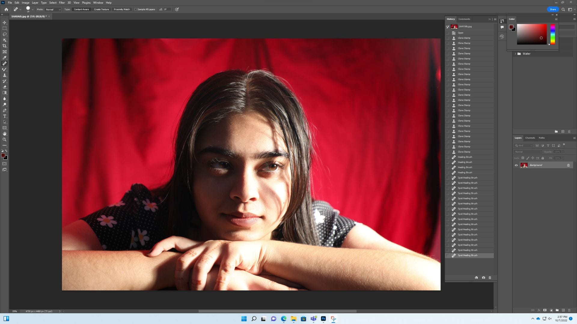
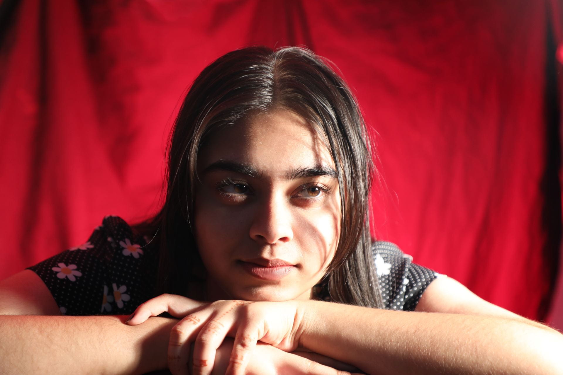
Today is the day I recreate! We used the strobe light, the hot light, a red gel, a probe light. a black sheet, some clips and some duct tape. I also used photoshop to edit out any errors or imperfections. I took many photos and here are the ones that came out the best in my opinion!


10/13/22:
Today I was lent a camera to start my photo story. My ideas were either young love in high school (high school sweethearts) or the art of band. I decided to stick with the art of band and thought about how I would put these together.
10/14/22:
Today I started taking pictures of band. The band here was on the field so I was able to take pictures of them in action practicing their show, “Agent 54.” I walked around the band whilst they were performing. I took pictures of varies things like the instruments, the color guard flags, people in formations, etc. I will take more pictures throughout the week next week and figure out how to compose and put together these photos.
10/17/22:
Today band was watching a video of their performance at a competition on Saturday, so I took pictures of the captains of band such as the drum major and the color guard instructor.
10/18/22:
Today I went with band to take pictures. Since they were inside, I was able to capture the process of what they do inside.
10/19/22:
Today I did the same thing and took some pictures of the band as I did on Monday (10/17/22). The entire band was inside today so I got pictures of everyone inside the band room.
10/20/22:
Today I took some final photos of band. Everyone was in their own sections which led me to be able to take photos of the certain sections of band. I got some pictures of drumline, brass, woodwinds, and pit. I also uploaded the pictures to my OneDrive and went through the photos and deleted the ones I didn’t like or that came out bad in my opinion.
10/21/22:
I went through the photos again and choose the ones I liked the best out of 200 photos, which as you can imagine, was difficult. I am now uploading the pictures into Adobe Express.
10/24/22:
Today in class we did a scavenger hunt. I also entered my photos in Adobe Express and made my photo story!
10/31/22:
Today I started the process of screen printing. I got my screen and I put light paint on the screen with a scooper. I let it dry for 24 hours.
11/1/22:
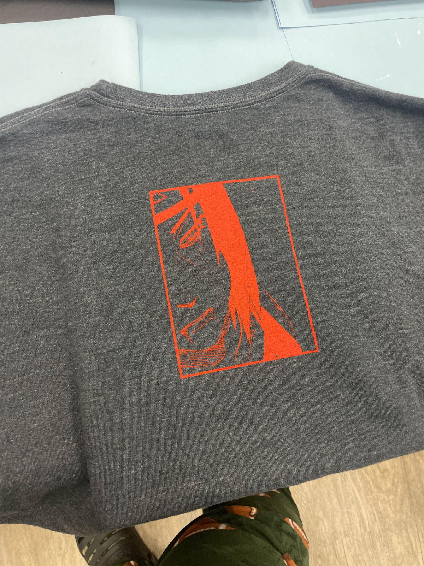
Today I transferred my print onto the screen! We put the image over the screen and put light on it. We let that sit for 18 minutes and after I got a damp rag and wiped of the paint covering the image. I let that dry for the rest of the day. Here’s my image that I’m screen printing!

11/3/22:
Today I tried transferring the print! I did two tests, one on black and another on white paper. I then used a practice shirt to put the print! I believe the print came out pretty cool!


11/17/22:
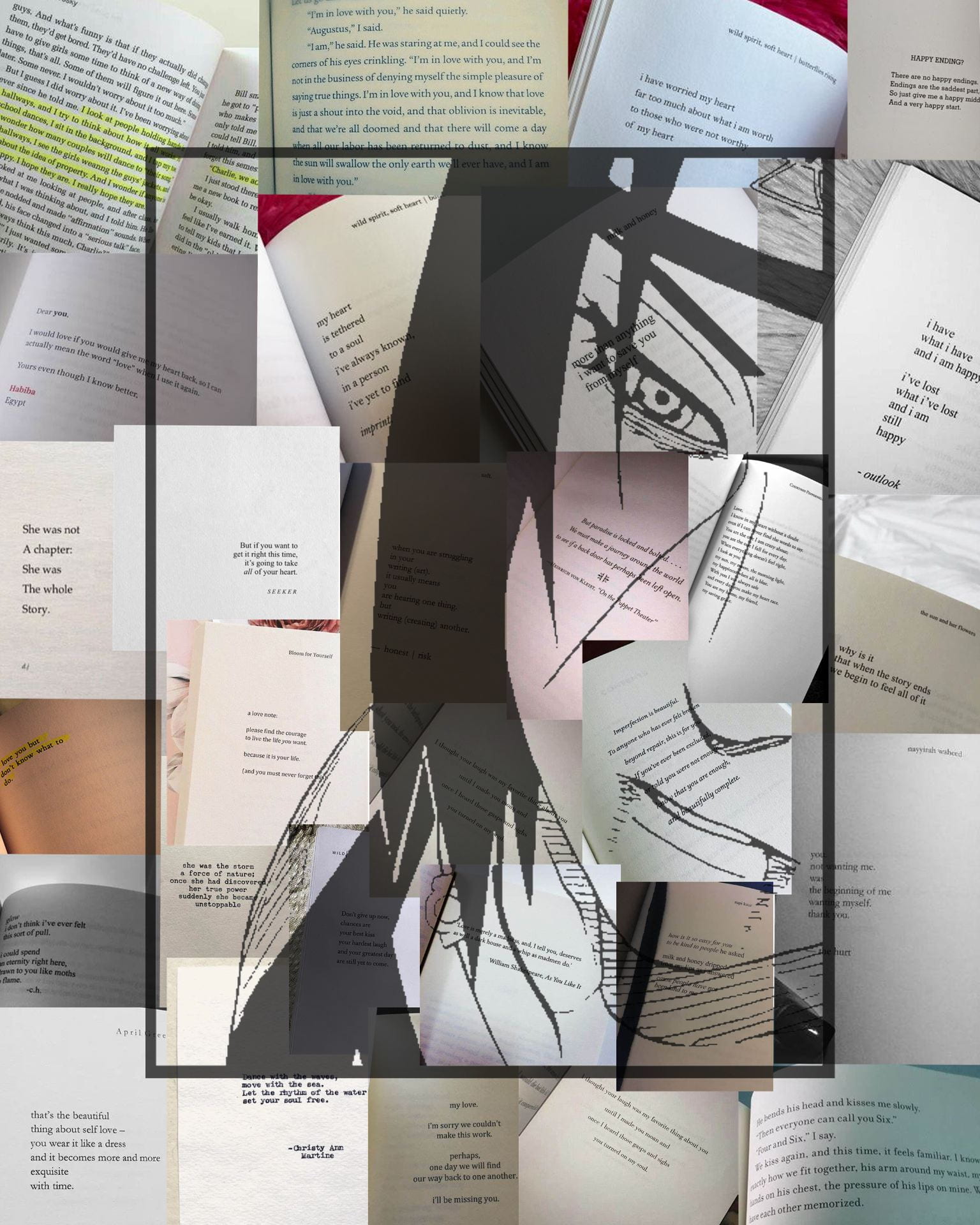
Today I did my mixed media. I put together a collage of quotes from poetry books and then overlayed my screen print on top!

12/1/22:
Today I had started to jot down ideas of what I wanted to do as my “Make a Statement” assignment. I wanted to something that circulated around body image and beauty standards because in my opinion, although it is mentioned, it’s not spoken about quite enough, so I feel like it would be amazing if I made a statement about that.
12/2/22:
I decided to stick with my initial idea and pursue the body standards. My motto for my assignment is, “Our body is NOT your blueprint.” I thought it was catchy but also went straight to the point. What I’ll actually do for my project is a collage of “imperfections” and ideals for body standards.
12/3/22:
Today I got to work and put my piece together. I went with an orange/yellow pastel for the background and cropped out magazine letters to form my caption. Then I gathered images about different body parts and put them altogether. Here’s the final product! I think it came out well :).

1/11/23:
Today we started the two assignments assigned to us: Keith Haring inspired work and body, shape, and form. I decided to jot down some ideas of what I wanted to draw for the keith haring inspired work. I decided to go with a sunny background with someone crying.
1/12/23:
Today I drew the Keith haring inspired work. I made a square to start off with, being the frame of the picture, then i started to draw the sun in the top left corner with wavy beams. I then drew the person in the middle of the picture, having it facing sideways and having its arm to its face to represent itself crying. I drew some tears alongside the face. Then I drew the floor, which was a line across approximately a quarter of the frame. I drew in lines for the grass and then flowers and the shadow of the person. Then I added mini lines everywhere for the signature Keith haring look. I added color after that with double sided alcohol markers, and made the person have a shadow area with a led pencil. This is how it turned out:
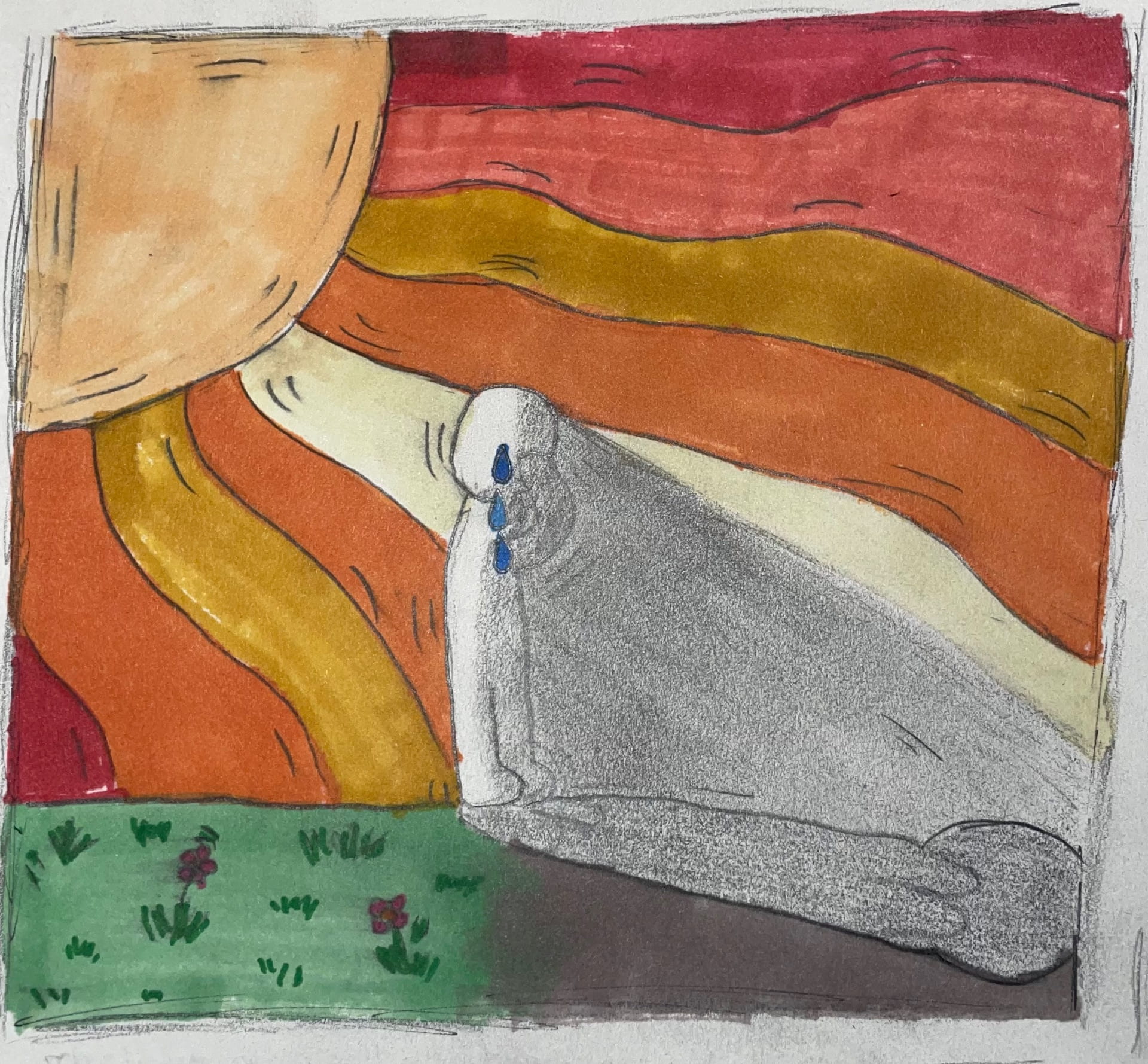
I developed as an artist from this because I don’t usually draw, so I used this opportunity to draw something. Since Keith Haring’s is fairly simplistic, I knew I was able to tackle this assignment easily. I will probably use this work of mine for the IB Exhibition to show not only its meaning, but also that you can draw work without being a complete artist.
1/13/23:
Today I took photos for the “body, shape, and form” assignment. y two main models were Matthew Bahena and Angelina Grijalva. I used the light room for the photos: it had a black sheet for the background and two hot lights. I didn’t necessarily have them do a specific pose, but I did want both front and back pictures. After that, I edited any blemishes on photoshop and made one of the photos (Matthew’s) black and white. Here’s how they turned out.

In my opinion, I think this came out as a success. It feels like a success because of the framing and the lighting of the photos boosts its quality. I purposefully did the composition and positioning as I did to add more emotion and maybe even lure and intrigue the viewers more. It added more quality and expression towards it. Some criteria for others to judge this work is that I had used only two hot lights and a black background because of it was what was provided. I also did not choose their outfits or their hairstyle, etc. So think of this artwork as a more personal expression rather than critiqued. I think the emotion of the one representing hands, arms, and neck can show masculinity and strength in a way with its modest but bold expression. With the shoulder one, it gives more femininity and sereneness.